
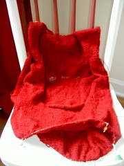
Remember this?
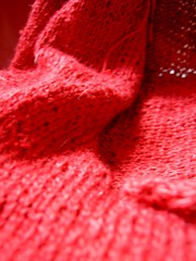
(Sorry for the sucky picture... it's very gray out right now. here's a slightly better close-up:)
That would be my Sahara that I was pretty convinced was headed for disaster. Well then I Ravelry’d it and decided that if the armholes are a little large it will just come out with more of a dropped shoulder look. I can live with that. Especially since I plan on wearing a cami under this anyways. So I kept up with the knitting and now I’m at a point where I have to make a decision.
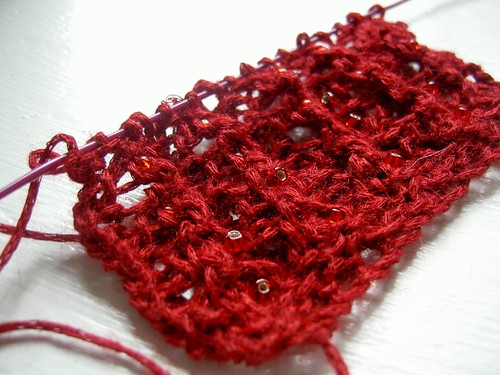
To bling or not to bling.
I knit this swatch of the ribbing for the bottom, neckline, and armholes to check out the bling/no bling situation. I knit two repeats of the pattern w/o bling, then I slipped a bead onto the knitting at the center of each pattern for two repeats:
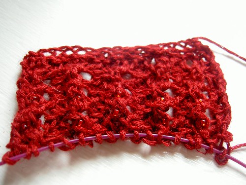
At first I thought: Needs more cowbell. I mean you can barely even see the bling! But I was pretty married to the plan of centering the beads on the diamonds… I’m picturing neat little rows of sparkle accentuating the v of the neckline. So I think rather than adding more beads I should just use different beads.
Because really when given the choice you always gotta go with the bling.
So ok then. I know how many/where I want them… but which beads should I use?
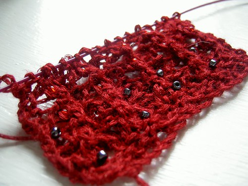
The Original Red bling:
I think this one may be too subtle.
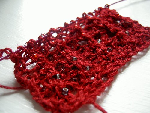
Shiny Gray Bling:
Getting closer…
White Bling:

I think this might be too… white…
Black Bling:
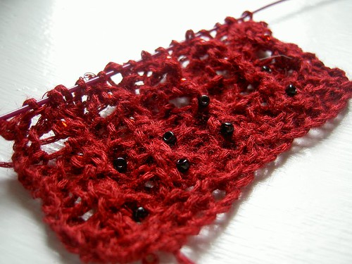
Don’t know if this is shiny enough but it could work.
Or Silvery Gray Bling:
Also getting closer…
What do you guys think?
I vote for the silvery gray bling!
ReplyDeleteSilvery grey bling!
ReplyDeletei like the shiny gray :)
ReplyDeleteI'm probably going to have to agree about the silvery gray bling - it's noticeable enough without smacking you in the face with bling. The shiny gray is kinda nice too - second runner up. The black is too much of a contrast, unless you're a UC cheerleader. The clear/white doesn't looked polished enough. The original red is nice, but won't be noticeable unless someone is two inches from you staring at your chest. So anyway, sorry about the long post, but that's my vote!
ReplyDeleteI like silvery gray, too. I kinda like the white too, though ... maybe it would look whiter and more obvious in different light.
ReplyDeleteI like the gray ones, but I also like the red on red. I think when it is worn vertically, the red would catch the light since the texture differs so markedly from the yarn.
ReplyDeletemarjorie/primetimeknitter.typepad.com
I like the white and the silvery grey. :)
ReplyDeleteI like the silvery gray best or just the red is nice too!
ReplyDeleteThis is the order I like - silver grey, red, white. Very pretty!
ReplyDeleteKnow what would be perfect? Silver with red centers. They probably don't even make such a bead. :(
ReplyDeleteI like the silvery grey for its subtleness and the shiny grey for its "pop".
ReplyDeleteshiny grey! shiny grey!
ReplyDeletesilvery gray all the way ;)
ReplyDeletedefinitely either silvery grey or the shiny grey... both look nice!! Gotta have bling!
ReplyDeleteScrew the grey I like the red. It's subtle but it's perfectly matched. I think you'll appreciate it's subtley once it's done.
ReplyDeleteI'm thinking if you want more pop, go for the shiny grey, but I also like the subtleness of the red. (But I'm not known for stepping out there with a lot of bling.) Whatever you decide, it will be gorgeous!
ReplyDeleteI think the silvery grey bling looks great!
ReplyDeleteRed, definitely! Subtle.
ReplyDelete