
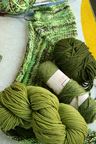
Some green possibilities:
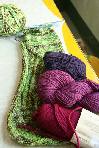
Some purple/pink possibilites:
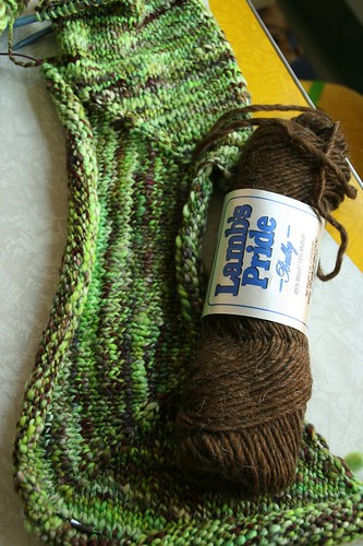
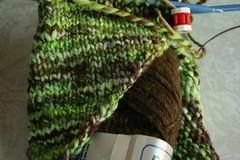
A brown possibility:
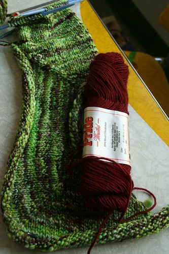
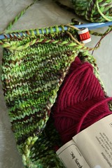
And a burgundy red possibility:
The brown is what I initially thought I would like but it’s just too…brown. The darker colors in the handspun are much more red:
So I think that’s out.
So then I tried the pinks/purples… This pink one is waaaay brighter than in the picture:
I don’t think I can pull off a bright pink and bright green shrug. One bright is plenty for someone who is in their late 20’s I think.
I like the color of this pink/purple:
But Matt thinks it clashes and he has a good eye for these types of things.
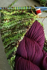
The dark purple seemed to be close:
Although the darks in the handspun are much more red than purple. Not sure that matters, though, since the deep purple looks good with the bright green.
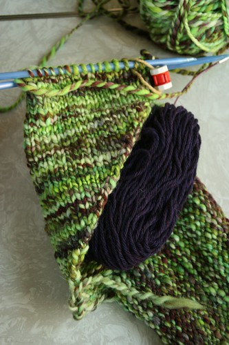
None of the greens really did it for me except for this one:
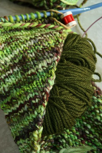
But as Matt put it “the olive would work but it’s just not that interesting.” No. No, it’s not. But how interesting does a shrug need to be?
The one we both kept going back to was actually one I pulled out thinking “there’s no way this will work”:
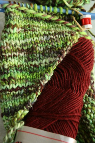
But it totally does. It’s called medieval red and it’s honestly the same exact shade as the reds in the handspun. I think it picks those up quite nicely…
So basically I’m deciding between those last three:
Dark purple - I like it but it might not be quite right with the handspun
Olive – while uninteresting is still nice
Medieval Red - matches the handspun yarn perfectly but might be a bit much with the red and green
What do you guys think?
Oh and I decided defiantly not to do the ribbing in handspun. I think the smooth commercial yarn will set off my less than perfect spinning in a really nice way…
Medieval red all the way. That was my choice before I even saw that you narrowed it down to a final choice!
ReplyDeleteAnd my offer to buy the shrug once you're done (if you hate it) still stands. Seriously. I'm just sayin'.
Yep. Medieval red. That's the one.
ReplyDeleteHoly Stash diving Batman! It feels so good when your stash produces viable options.
ReplyDeleteLove checking out the color choices. As I kept scrolling down I kept going 'ooohhh, no wait that one, no that one.'
My vote is for the Olive. We know you rock green, re Wicked.
Looking forward to seeing what you select.
Hope it is not too late to put 2 cents in! ;o)
ReplyDeleteI actually like the 4th pic with "burgundy red" or the Medieval red....as long as it is RED of course! ;op
But seriously I like the burgundy best!
Can't to what you decide on!
Love it with the red - your handspun is really gorgeous yarn!
ReplyDeleteWow, love how many stash diving options you found!! I think it might be hard to tell from the pictures - you are probably better off going with what you think is best IRL. But yes, the Medieval Red looks really nice and sounds like it will be the perfect compliment.
ReplyDeleteI vote for either the olive or the red. I guess you can see the true colors better than we can plus it also depends on if you want it to pop or be toned down. Both look good. And I say toned down simply because you say it is bright green even though it really doesn't look too bright on the screen. :-)
ReplyDeleteOut of the last three, I immediately seem to like the dark purple, but I also think that red picks up the colors in the sock in a really interesting way, and might be a more unique-looking solution.
ReplyDeleteMedieval Red. ABSO - FREAKIN - LUTELY!
ReplyDeleteolive or red- personally i think red would give it the pizzazz you are looking for!
ReplyDeletered. olive is boring. you are far from boring!
ReplyDeleteI'm going to vote against the tide here and say olive. It doesn't compete or detract from your fab handspun, which is really the star! (I'd be a tad concerned that a solid red against the green might have a bit of a Christmas-y look. I love Christmas, just not as a fashion statement.)
ReplyDeleteI am also going against the grain...PURPLE! I like the contrast and the fact that it isn't all matchy-matchy.
ReplyDeleteMedieval Red is #1 with a bullet imho!
ReplyDeleteWell Dude whatcha decide?
ReplyDeleteLove the medieval red. That's the one all right!
ReplyDeleteThe Medieval red does look good--nice choice.
ReplyDeleteA stash is handy for things like that, and I love to go "stash fishing" when I need small amounts of yarn for gifts. But after the years I've spent accumulating it, I think less is better than more. I'd have less guilt when I wanted to buy something new.